Monday 16 December 2013

Feedback questionnaire results


Feedback Questionnaire

1.       What is your age?
*       11 -20
*       21 – 30
*       31+
2.       What is your gender?
*       Female
*       Male
3.       Do you know what folk is?
*       Yes
*       No
4.       If yes, to the question above, then name a folk singer/band
………………………………………………………………………………………………………………………………………………………………………………
………………………………………………………………………………………………………………………………………………………………………………
………………………………………………………………………………
5.       Do you think our video fits the typical folk genre you see, such as Passenger and Gabrielle Aplin?
*       Yes
*       No
*       Other
6.       If yes, to the question above, please explain why
………………………………………………………………………………………………………………
………………………………………………………………………………………………………………
………………………………………………………………………………………………………………
………………………………………………………………………………………………………………
7.       Do you think there is a common theme throughout our digipak, promo and advert?
*       Yes
*       No
8.       Do you think there could be any improvements on the digipak, promo and advert?
*       Yes
*       No

Please explain why
……………………………………………………………………………………………………
……………………………………………………………………………………………………
……………………………………………………………………………………………………
……………………………………………………………………………………………………
………………………………………………………………….

9.       Out of ten what would you give each of our products?
Digipak -   /10
Advert -   /10
Promo -   /10
10.   Any other points?
……………………………………………………………………………………………………
……………………………………………………………………………………………………
……………………………………………………………………………………………………
……………………………………………………………………………………………………
…………………………………………………………………………………………………..
……………………………………………………………………………………………………
……………………………………………………………………………………………………
……………………………………………………………………………………………………
……………………………………………………………………………………………………

Wednesday 11 December 2013

Feedback from FaceBook

I posted the video on Facebook and this is the feedback it got so far.

Another idea


I created this on Pixlr using a background with pictures of Laura and Ronnie ontop. I placed a black band at the bottom to make the text about the album stand out more. I placed the title of the band and the album at the top as they are the most important things on the advert. I then placed a picture of the album in the middle of the advert so it is like everything is revolving around it. The picture of Laura is bigger than Ronnie's as Laura is the person who is focused on more in our video so I wanted to keep that theme in the advert. Everything is in black, grey and white as it is a more vintage look which is normally associated with the folk genre


Friday 6 December 2013

Another draft


I did this on pixlr. I took a photo of Laura and Ronnie and edited on pixlr, it was already in black and white so I edited the brightness of it so that it came out like this. I then added the text both from dafont.com and a part from the origianl bands logo and then added a picture of the album cover in the corner.

Draft of Magazine advert


My ideas
These are currently our ideas that we have for our own advert. We are discussing and developing our ideas further then we will create our final one.


The one above  was edited on pixlr. I took both the photos included and edited them. Then added on some writing from dafont.com.

The one above was edited on pixlr. I took all the photos included and edited them. Then added on some writing from dafont.com.


The one above was edited on pixlr. I took both the photos included and edited them. Then added on some writing from dafont.com.
The one above was edited on pixlr. I took all the photos included and edited them. Then added on some writing from dafont.com.

Thursday 5 December 2013

Final digipak

This is our final digipak. It is six panels and five of the six are our own pictures which I took myself and edited using Pixlr online. When we were deciding which pictures to use we made sure that they all were similar. We also decided to use the logo of the actual band as we thought that we should incorporate them in it in some way. The front panel is the bottom right picture. We thought that the picture was a simple and beautiful picture which would show happiness because of the bright colours but because it is simple it suits the genre as most digipaks and album covers of the folk genre as very simple. The writing on it is from the website dafont.com. I thought that the writing was simple and fitted the genre but it also looked good and stood out against the bright background. The panel next to it is the back panel. I also took that photo when we were at Shillingthorpe park and I thought that it was so beautiful that it should be used in our project in some way whether our music video or the advert or the digipak. I edited it on Pixlr, using a the black fade effect around the edges as I used on the front panel. It makes the colours of the picture stand out and makes you look at the picture but also the text that is on it. the text on it is the names and numbers of the tracks. The first one is our actual track and the rest are made up as you don't only have one song on a digipak. The panels next to that is the logo of the actual band. we didn't have any other pictures that would link with the others so we came up with the idea to use their logo. Above the logo panel is a picture from when we were doing the performance video. I cut the background out of the picture and stuck them on a olden wooden stage that you would see in folk videos and then washed out the colour to give it an olden photo effect but to make it simple and soft as well. The panel next to it is where the CD will go. Again I took the photo and edited it to make the colours bright and stand out and then put the name of the band underneath as if the band is suddenly being revealed when you take the CD out. The next panel is a picture of Ronnie and Laura as they are the performers they had to be included somewhere on the digipak. It is a simple photo of just the two of them so that you can see them. The black boxes are the side panels when the digipak is folded.   
 

Wednesday 4 December 2013

Draft of our digipak

Since the band’s name is 'Sound of the Sirens' my group and Laura thought that it would be a good idea to link the theme of Sirens with the front cover for our digipak.
 Ronnie draw this picture to create a primary source from an inspiration that we found on the Internet when performing our research on Sirens. By adding different colours and texture to the picture, it gives the audience an idea of good and bad sides to Sirens themselves. But keeping the 'Malevolent Sirens' in black and white give the impression that it isn't as friendly and kind like the one above. Ronnie chose the contrast to emphasize on the duplicity of sirens.
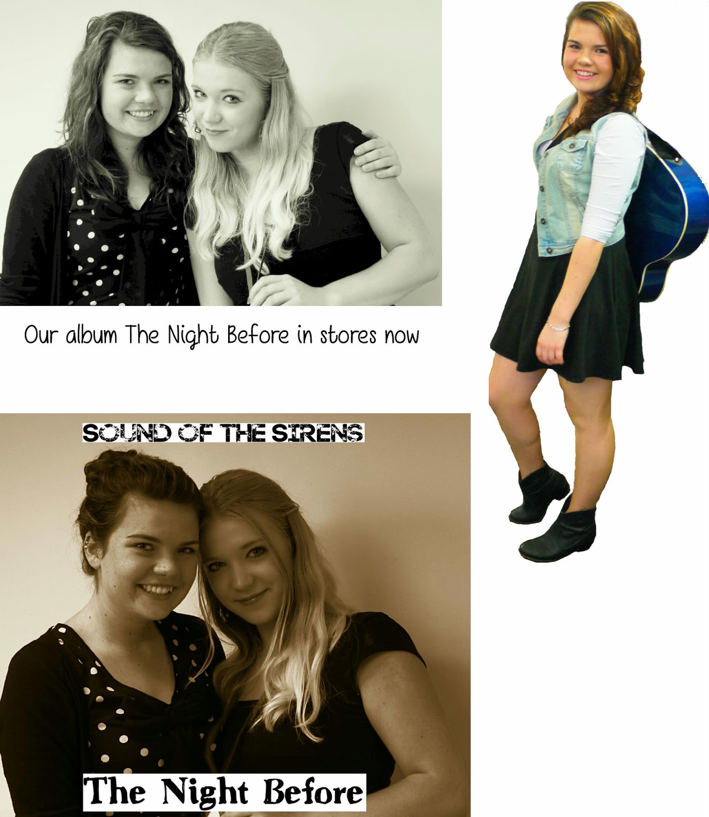
These two pictures were taken when my group was in process with creating our music video. We thought that if we experimented and went well then we could use it later on however if we chosen not to use it then it only shows positive evidence towards our coursework.

We decided to spice it up a little by putting a simple and effective effect on it and this enriches the colours in the shot. By doing placing the black shade in the corners of the picture, it enhances the two main elements in the shot, the band members. We thought that it would be effective to do so because we wanted people to focus on the picture and link it to the music which has been produced.

The picture below is only a slight change from the one above since there isn't a black clouded effect around the edges.
 

This is an idea we had for the back cover for the digipak. This picture was taken when we filmed the narrative in Shillingthorpe Park. The lighting in the shot suggest a happy, bright and perhaps relieved atmosphere which is what we wanted to apply for the audience.


I edited the photo below to make it brighter to show happiness and as it is a path it is like it is saying it is leading you to happiness. I made sure that the colours popped so that it would stand out and be eye catching. 

This picture below I also edited it so that the colours stood out to represent happiness. I put a black fade effect around the edge so when people look at it they focus straight to the center of the photo where we are thinking about putting the title of the album but only the title as when we looked at Gabrielle Aplin's digipak she hid her face on it so that the audience only focused on the music rather than the look of the artist.  

This is the start of our digipak as we started to put it together. As you can only see four panels rather than six which will be our final product.  

Tuesday 3 December 2013

Ancillary task - music advert for a magazine

When we started to design our advert we looked at these examples for inspiration on what to include on our advert to make it look as realistic as possible. 


Laura also researched this to and analysed them: http://lauracuthbertsonadvancedproduction.blogspot.co.uk/2013/12/ancillary-task-magazine-adverts.html